Satellite Imagery for Detecting and Assessing Armyworm Damage in Agriculture
Learn how satellite imagery and AI help detect armyworm infestations early, assess crop damage, and support climate-resilient agriculture.


This project uses AI and multispectral satellite imagery to detect and assess fall armyworm damage across agricultural regions in West Africa. It demonstrates how AI-powered crop disease detection can help identify pest outbreaks earlier and support more targeted interventions. Analysing 2,000+ Sentinel-2 and Landsat-8 images and validating results with FAO field scouting data, the system classifies infestation severity and estimates field-level crop damage. The end-to-end pipeline spanning data extraction, modelling, and an inference API demonstrates how remote sensing can enable earlier pest detection, reduce yield losses, and support more targeted interventions, contributing to climate-resilient and scalable pest-monitoring systems.
Introduction
The fall armyworm (Spodoptera Frugiperda) has become one of the most destructive pests facing modern agriculture. Native to the Americas, this lepidopteran insect feeds on more than 350 plant species including maize, rice, sorghum, sugarcane, wheat, vegetables and cotton. After its arrival in Africa in 2016, the pest spread rapidly across sub‑Saharan Africa, the Indian subcontinent, Asia and Oceania, and by 2021 it had invaded more than 70 countries. Ideal climatic conditions in many parts of Africa and Asia allow the pest to produce several generations per season, making it likely to become endemic.
Understanding where the fall armyworm is present and how severe its damage is can help farmers respond quickly. Early detection is especially important for climate‑resilient farming because timely interventions reduce yield losses and avoid unnecessary pesticide use. Although the project described here focuses on satellite‑based detection, its findings also connect to weather forecasting for agriculture and AI weather prediction because crop health and pest outbreaks are closely linked to weather and climate. Many of these early-warning and climate-resilient approaches are already being adopted by leading sustainable agriculture organizations working at the intersection of AI, satellite data, and farming systems.
Two maps illustrate why early detection matters. The first image shows the global distribution of fall armyworm and the second tracks how quickly the pest expanded across continents after 2016. These figures underscore a sobering reality: a pest that was once localised has become a global threat.

Fig1. Map of the worldwide spread of fall armyworm since 2016
Problem Statement
Armyworms, including the fall armyworm, are caterpillar pests of grasses and cereal crops. A single hungry caterpillar can devastate an entire field, reducing yields and increasing costs for farmers. Although the fall armyworm prefers maize, it also feeds on other crops vital to food security, such as rice and sorghum. Traditional detection methods rely on scouts inspecting fields, but such approaches are labour‑intensive and often too slow to enable timely interventions. Since the pest’s arrival in Africa, outbreaks have been reported in countries such as Mali, Côte d’Ivoire and Uganda, placing enormous pressure on food production systems. Early detection and accurate assessment of infestation severity are therefore critical for mitigating losses and supporting climate‑resilient agriculture.
Project Scope And Deliverables
To address the fall armyworm challenge in southern Mali, the Omdena–OKO project defined a clear scope for data collection, modelling and delivery. Key elements included:
- Dataset collection – more than 2 000 multispectral satellite images were collected from open‑source sources such as Sentinel‑2 and Landsat‑8. Longer time‑series datasets were preferred to capture seasonal variability.
- Geographic focus – the images covered Mali and neighbouring countries where fall armyworm infestations had been reported. These regions were chosen to balance data availability with the need to observe different agro‑ecological conditions.
- Validation datasets – field reports from the FAO fall armyworm scouting initiative were used to validate model predictions.
- Image detection – machine‑learning and deep‑learning models were built to detect areas affected by the pest.
- Damage assessment – based on detected pest areas, models predicted the percentage of a field damaged. Four categories were used: highly impacted (>75 %), medium impacted (51–75 %), low impacted (26–50 %) and no impact (<25 %).
- Crop classification – land‑cover datasets from regions with high pest occurrence (for example Burkina Faso) were used to train and test models to distinguish cropland and pasture land.
- Delivery – the final output included a pipeline packaged into an inference API and a web application that allowed users to query the models for specific locations and dates. Comprehensive documentation of data sources, methodologies and results was also provided.
These deliverables reflect a full end‑to‑end workflow: from data acquisition through preprocessing and modelling to deployment. They also show how AI weather prediction tools (such as climate and vegetation indices) can be integrated with satellite imagery to support weather forecasting for agriculture and pest management.
Approach and Methodology
Project Timeline
The team followed a structured ten‑week timeline. Weeks 1–2 focused on defining the problem statement and exploring data sources. Weeks 3–4 involved data preparation and analysis. Week 5 marked the mid‑term project meeting and the start of modelling. Weeks 6–7 were dedicated to refining preprocessing and modelling, while Weeks 8–10 centred on solution alignment, final expectations, documentation and inference API development. The overall timeline is illustrated below.

Figure 3. Project timeline – from problem statement, data exploration, preparation and modelling through to final expectations and inference API
Machine and Deep‑Learning Approaches
The basic workflow for building models involved data collection, preprocessing, model building, training and testing. Machine‑learning (ML) methods perform well in low‑dimensional spaces and require fewer samples, whereas deep‑learning (DL) models demand large volumes of data but can learn complex patterns, particularly in images. The team experimented with both supervised and unsupervised learning. These modelling strategies align closely with computer-vision pipelines used in related agricultural applications such as weed and crop detection using computer vision on drone imagery, where spatial patterns are learned directly from visual data. Figure 4 depicts the standard pipeline for ML models, and Figure 5 presents the combined workflow for supervised and unsupervised approaches used in this project.

Figure 4. Basic flow for building the ML model
While this first diagram outlines the conventional machine‑learning pipeline, the following flowchart integrates both supervised and unsupervised approaches. It shows how various data sources connect to image extraction, vegetation‑index maps and the modelling algorithms used in this project.

Figure 5. Flowchart showing supervised and unsupervised approaches
Connecting data sources (Radiant ML Hub, FAO fall armyworm scouts data, populated places data, LandCover dataset) to image extraction, vegetation‑index change maps and modelling algorithms
Data Sources
The following data sources were used across tasks:
- Sentinel‑2 – multispectral images with high spatial resolution.
- Landsat‑8 – multispectral satellite images providing long time series.
- FAO fall armyworm scouts – field reports of infestation location and severity.
- Populated places – administrative boundaries to filter geolocations.
- Land Use Land Cover (LULC) – maps of cropland and pasture land for masking.
- Radiant ML Hub – land‑cover datasets with pixel‑wise labels.
Data Acquisition and Exploratory Data Analysis
1. Satellite Data Sources and Exploratory Data Analysis
The purpose of this task was to collect relevant satellite images from the FAO dataset, Landsat‑8, Sentinel‑2, Planet imagery, populated places, LULC and Radiant ML Hub, and to perform exploratory data analysis (EDA). FAO scouting locations were concentrated in West Africa, primarily Burkina Faso and Togo. Four infestation categories were defined: <25%, 26–50%, 51–75% and >75%. Most locations (~60%) had infestation levels below 25%, and only about 5% showed >75% infestation. Figure 6 illustrates the distribution of scouting points, their counts by country and infestation levels.

Figure 6. FAW ‘infestation’ categories (A); FAO FAW monitoring points (B); FAW infestation levels (C) in Mali and its neighbours
An initial EDA of the base dataset revealed a high proportion of records with missing data, a range of hectares checked and a sample normalized difference vegetation index (NDVI) image. Figure 7 shows infestation categories, top ten hectare counts and an NDVI sample.

Figure 7. EDA sample showing infestation categories (A), top ten counts (B) and an NDVI sample (C) of FAW in West African countries
2. Data Collection: Sentinel‑2 and Data Extraction Tool
To automate image extraction, the team developed a data extraction tool. The tool accepts CSV files containing geolocations and survey dates and outputs four‑band arrays (R, G, B and near‑infrared) along with computed vegetation indices. Figure 8 compares a true‑colour (RGB) image with various vegetation‑index images (arvi, cvi, gci, gndvi, ndvi, rdvi, savi, tvi).
The tool can be executed from the command line. It expects a CSV file with columns id, lon, lat, YYYY‑MM‑DD and Prevalence and provides optional arguments to display help or to extract images (Figure 30).

Figure 8. Command‑line options for the data extraction tool
In addition to a flexible command‑line interface, the extraction tool generates visual outputs. These outputs include an RGB image and a suite of vegetation‑index images, allowing users to compare true‑colour scenes with spectral indices that reveal different aspects of crop health. The next figure illustrates these output images.

Figure 9. RGB image and image outputs of vegetation indices using the data extraction tool
3. Data Collection: Radiant ML Hub
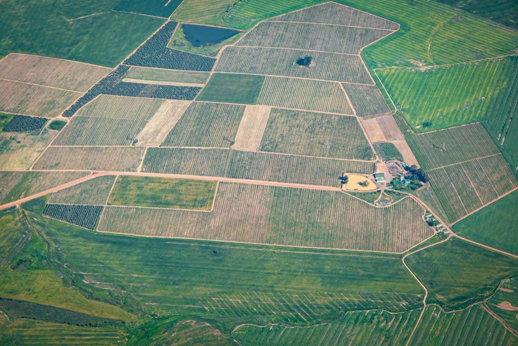
The segmentation model inputs consist of images of different landscapes and their corresponding pixel‑wise labels. Radiant ML Hub provides a land‑cover dataset for the entire African continent for 2018, making it a suitable choice. Images were retrieved for June–October, the rainy season for most West African countries. However, June and July images often appeared barren, so the period was restricted to August–October. Figure 9 shows vegetation‑cover images from Radiant ML Hub along with corresponding labels.

Figure 10. Vegetation cover images from Radiant ML Hub LandCover Net‑2018 in West Africa (June to October)
4. Key Challenges and Proposed Solutions in Data Collection
Challenge 1 – geolocation mismatch: FAO geolocations sometimes corresponded to urban areas rather than maize fields. After cross‑verification with experts (including David Hughes from PlantVillage) the team confirmed that many FAO coordinates were not accurate. Two solutions were implemented: (1) filter geolocations based on administrative boundaries to retain only villages and hamlets, and include FAO points within a 3 km radius; and (2) use LULC grids to select areas with high vegetation percentages.
Challenge 2 – ground‑area selection: Images must capture sufficient vegetation without covering an overly large area. After testing different radii, a 3 km radius was adopted as a compromise.
Challenge 3 – selecting before/after time gaps: Pest damage becomes visible only at later growth stages. A 14‑day gap between images was chosen to capture visible infestation, although this parameter can be adjusted.
Data Preprocessing
The preprocessing task aimed to clean and transform the data through image augmentation, custom image generators, feature extraction, feature scaling, outlier handling and balancing. Vegetation indices (NDVI, GNDVI, RDVI, CVI, GCI, SAVI, TVI, ARVI) were extracted from the RGB‑NIR bands to capture crop health. Similar multispectral techniques are also used at finer spatial resolutions in drone-based systems, as shown in Omdena’s work on predicting plant health using multispectral drone data. Additional steps included clustering to remove outliers, data augmentation to generate more examples of underrepresented classes and oversampling via the synthetic minority oversampling technique (SMOTE). The following figures illustrate key preprocessing techniques—clustering output, data‑augmentation examples and SMOTE balancing—and show how outlier removal sharpens the dataset, augmentation expands it and SMOTE produces a more balanced class distribution.

Figure 11. Implementing outlier removal using clustering
This diagram demonstrates how clustering separates atypical data points from the main distribution, ensuring that the dataset used for modelling reflects genuine patterns rather than noise.

Figure 12. An example of data augmentation. Source: https://en.wikipedia.org/wiki/Data_augmentation
Here data augmentation is visualised by creating slightly modified versions of existing images (for example, through rotations or flips), thereby expanding the training set and reducing overfitting.

Figure 13. Using SMOTE to balance the dataset
The SMOTE technique synthesises new samples for under‑represented classes. This balancing step helps classifiers learn equally from all infestation categories, which is crucial when some classes are rare.
For further reading on preprocessing techniques, the team compiled a resource library, including articles, documentation and links such as the SMOTE package and tutorials on data augmentation.
Model Building
Consolidated Model Overview
Collaborators explored a wide range of algorithms and consolidated their work with corresponding GitHub links. Models included:
- Supervised ML models: logistic regression (both simple and multinomial), k‑nearest neighbours (KNN), naïve Bayes, support vector classifier (SVC), decision tree, random forest, and ensemble methods (bagging and boosting).
- Unsupervised ML model: K‑means clustering.
- Supervised DL models: InceptionV3, EfficientNet, VGG16, VGG19, Xception and ResNet‑50.
- Unsupervised DL models: U‑Net semantic segmentation and direct comparison of vegetation‑index images.
All models were re‑run on balanced datasets created via SMOTE to evaluate their improvements.
Mean Index Modelling
Models in this category used the mean values of vegetation indices. Training data consisted of 5‑hectare squares centred on geolocations within 2 km of FAO records and having at least 99% cropland coverage within 4‑hectare buffers (according to 2020 LULC grids). Images were 100 pixels square and captured within 14 days after scout survey dates (i.e. current images). A correlation matrix of vegetation indices revealed relationships among features (Figure 13).

Figure 14. Heat map of vegetation indices
Simple Linear Regression
Using infestation percentage as a continuous target and CVI as the single input feature yielded low performance: training R² ≈ 0.05 with MAE ≈ 16.6 and RMSE ≈ 21.4; test R² ≈ 0.048 with similar error metrics. Such accuracy (~5%) was deemed too low for deployment.
Multi‑Linear Regression
Including all vegetation indices (NDVI, GNDVI, RDVI, CVI, GCI, SAVI, TVI, ARVI) improved performance slightly (training R² ≈ 0.095, test R² ≈ 0.082) but remained insufficient. NDVI and SAVI were the most important features, yet overall accuracy was still low. A variant using only NDVI, SAVI and TVI performed worse and was discarded.
K‑Nearest Neighbours (KNN) Classifier
Given that most recorded infestation percentages were low, four class boundaries were defined: zero, 0–20%, 20–50% and 50–100%. (A five‑class scheme was considered for future datasets.) The data were imbalanced: class 0 (zero infestation) had 525 examples, class 1 had 1 593, class 2 had 1 682 and class 3 had 384. After splitting the data into training and test sets, a KNN classifier was tuned via grid search. A model with two neighbours (n = 2) performed best. Figure 14 shows the confusion matrix for the best model.

Figure 15. Confusion matrix of actual vs predicted labels for KNN classifier
Performance metrics for the tuned KNN model were as follows: training accuracy ≈ 58%, precision ≈ 54%, recall ≈ 52% and F1 ≈ 50%; test accuracy ≈ 71%, precision ≈ 79%, recall ≈ 67% and F1 ≈ 68%. Although accuracy improved on the test set, the model struggled with the rare class (high infestation), achieving low recall (~29%).
During hyperparameter tuning, the team evaluated how train and test scores varied with different values of k. Figure 31 plots the declining training and test scores as the number of neighbours increases, highlighting the trade‑off between bias and variance.

Figure 16. Train and test scores as a function of the number of KNN neighbours
Other Models
Decision tree: training accuracy ≈ 57.5%; test accuracy ≈ 56.5%. Precision, recall and F1 scores hovered around 0.53–0.55 for both training and test sets.
Random forest: training accuracy ≈ 58.9% (precision ≈ 0.59, recall ≈ 0.55, F1 ≈ 0.56); test accuracy ≈ 58.4% (precision ≈ 0.59, recall ≈ 0.52, F1 ≈ 0.54). The following figures present SHAP explanations showing feature contributions for decision tree and random forest models.

Figure 17. SHAP explainer illustrating feature importance for decision tree model
Both explainers highlight how the models rely on specific vegetation indices and other features to make predictions. The decision tree explainer illustrates how individual splits depend on key indices, whereas the random forest explainer demonstrates how an ensemble of trees aggregates feature contributions for improved stability and generalisation.

Figure 19. SHAP explainer illustrating feature importance for random forest model
Support vector machine (SVM): the SVM classifier performed poorly, with training accuracy ≈ 42.8% and test accuracy ≈ 41.4%. Precision and recall were low across classes, and some classes were not predicted at all. Grid search for SVM was postponed due to limited data quality and time.
Multinomial logistic regression: mean accuracy on repeated stratified k‑fold cross‑validation was about 45%. Confusion matrices showed that the model frequently misclassified minority classes. Training accuracy was 46% and test accuracy 45%; precision, recall and F1 scores were around 0.32–0.34.
Balanced Dataset Experiments
To address class imbalance, a balanced training set was created using SMOTE. The KNN classifier was retrained on the balanced data. The resulting confusion matrix (Figure 17) shows improved precision and recall for the high‑infestation class (precision ≈ 0.48, recall ≈ 0.46) but some reduction in performance for other classes. Overall accuracy on the balanced test set was 54%, with macro and weighted averages also at 54%.

Figure 19. Confusion matrix of KNN classifier on balanced dataset
For final predictions, the model accepted multiple images within 2 km of a location and returned the most common class among them (mode). Boundaries were adjusted to create more balanced data (zero, low (0–20%), medium (20–50%) and high (50–100%) infestation). The final prediction for the example location and date was “Medium.”
Unsupervised Model – K‑Means Clustering
An unsupervised K‑means clustering model was trained with four clusters to group pixels based on vegetation indices. Labels were reshaped into a 3D array to create segmented maps. Figure 18 shows sample clustering output images.

Figure 20. K‑mean clustering output images
Deep‑Learning Models
Image Classification and Area Prediction Using ResNet‑50
This investigation aimed to build a proof‑of‑concept model that could classify vegetation damage and predict the damaged area from satellite imagery. Sentinel 2A images (5 000 images of size 100 × 100) initially yielded a classification accuracy of 47% and area prediction RMSE of 0.2699. To improve performance, more data were collected: 1 040 images of size 498 × 497. Each image was resized to 500 × 500 and then split into twenty‑five 100 × 100 tiles, generating 26 000 images.
ResNet‑50 – a deep convolutional neural network with 50 layers – was selected for its ability to learn complex features. A pre‑trained ResNet‑50 model from TensorFlow‑Keras was fine‑tuned: the input layer was configured to accept three channels by stacking GCI, NDVI and SAVI images; and the output layer produced both the infestation class and damaged area. Figure 19 shows loss on area‑prediction training and Figure 20 shows root‑mean‑square error (RMSE) on area‑prediction training. Figures 21 and 22 depict accuracy and loss over epochs for infestation‑level training.

Figure 21. Area model loss versus epoch
The area‑loss curve plots how prediction error for damaged area changes over training epochs, providing a sense of convergence as the model learns.

Figure 22. Model area RMSE versus epoch
This plot tracks the root‑mean‑square error (RMSE) of area predictions, complementing the loss curve by focusing on the magnitude of prediction errors.

Figure 24. Infestation‑level model loss versus epoch
The accuracy curve shows how well the model classifies infestation levels over successive epochs, indicating improvements in discriminating between different damage categories.

Figure 24. Infestation‑level model loss versus epoch
This final plot depicts the decline in classification loss during training, demonstrating how the model minimises error while learning to differentiate infestation levels.
Key challenges in this investigation included severe class imbalance (most images corresponded to <25% infestation) and limited computational resources, which restricted the inclusion of underrepresented classes. Suggestions for future work include experimenting with other combinations of vegetation indices and augmenting data for minority classes. Detailed notebooks are available under Match_Labels_and_Data.ipynb, Difference_Maps.ipynb, Get_Area_and_Labels_from_the_Different_Maps.ipynb, *Stacking_gci,_ndvi,_savi.ipynb* and Area_and_Class_Model_Resnet50_new_data.ipynb.
Retrained EfficientNet Model
Another experiment retrained an EfficientNet model on cleaned data (after clustering). Using 30 epochs and batch size 16, the model achieved a training accuracy of 79.9% with recall 0.69 and precision 0.89. However, validation accuracy remained low (~12.5%) due to class imbalance. Figure 23 shows images used for EfficientNet training and Figures 24–25 present accuracy and loss versus epochs.

Figure 25. Images for the EfficientNet model
These sample images illustrate the diverse scenes used to train the EfficientNet model after data cleaning, providing the inputs for the subsequent performance plots.

Figure 26. Accuracy vs epoch of EfficientNet model
This chart presents how the training accuracy evolves with each epoch. Higher values indicate that the network correctly classifies more training examples as learning progresses.

Figure 27. Loss vs epoch of EfficientNet model
The corresponding loss curve shows the reduction in error over time. A downward trend signals that the model is fitting the training data more effectively.
InceptionV3 Using a Custom Image Generator
Pre‑trained image generators typically handle three‑channel RGB images. When taking the difference between before and after NDVI images, the result is single‑channel (400 × 400). A custom generator was therefore introduced to produce augmented single‑channel images, which were then reshaped to match the input of pre‑trained models such as InceptionV3. Figure 26 shows training accuracy and validation loss across epochs for the InceptionV3 model. Additional augmentations can be implemented using the imgaug library.

Figure 28. Accuracy and loss vs epoch of InceptionV3
Semantic Segmentation and Direct Comparison
An unsupervised approach using U-Net was employed to identify cropland/pasture land in the “before” image, demonstrating how image segmentation for crop monitoring can isolate relevant vegetation areas before analysing infestation patterns. A simpler technique involved direct comparison of indices: computing the mean of NDVI values for the current image and comparing it with a previous image. Results from direct comparison closely matched those from U‑Net, indicating that simple thresholding can provide insights into infestation levels. Figure 27 compares sample outputs from direct comparison and KNN predictions within the inference API.

Figure 29. Sample models predicting vegetation indices (VIs) using direct comparison (left) and VIs and FAW infestation level using KNN (right)
All details about the unsupervised approach are documented in the notebooks linked in the project repository.
Tools Used
The project leveraged Python for coding, GitHub and DAGsHub for version control, Google Colab and Jupyter Notebooks for development, and Streamlit for building the web interface. Additional tools included FastAPI for serving the inference API and various open‑source libraries for image processing and machine learning.
Inference API: How It Works
The inference API ties together data extraction, model prediction and user interaction. Both an online pipeline and a batch pipeline were implemented. A Streamlit web application allows users to enter latitude, longitude and a date, specify image dimensions and a time window, and select a model. The backend uses the Sentinel‑2 extractor to retrieve the relevant satellite imagery, passes it to the predictor (which loads the appropriate model files) and returns a JSON response containing vegetation indices and predicted infestation levels. Figure 28 shows the inference API interface and pipeline.

Figure 30. Inference API overview showing user input form, Sentinel‑2 extractor, predictor and response JSON
Sample predictions demonstrate two modes: direct (longitude, latitude → vegetation indices) and KNN (longitude, latitude → vegetation indices → infestation level). The API returns a JSON object with inputs and results as shown in Figure 27.
Further instructions for running the FastAPI service and pipeline are provided in the project’s README files.
Resource Collection and Knowledge Sharing
Another task focused on assembling resources and external links relevant to the Omdena–OKO challenge. Contributors gathered articles, documentation and tutorials to create a knowledge repository. The project provided a platform for newcomers to learn GitHub and other tools. Resources were collated in the Official Omdena OKO Project Resources Library and Data Sources Utilized in the Project documents. A word‑cloud visualization of contributions (Figure 29) celebrated the collaborative effort.
Links to the resource library: Official Omdena OKO Project Resources Library
Main Challenges
The team encountered several challenges throughout the project:
- Data set and quality – FAO geolocations frequently pointed to urban areas rather than fields; the meaning of null and zero infestation values was ambiguous; and substantial validity testing by FAO indicated that at least 60% of records were false or unverified. High‑quality training data with photographic evidence is essential for reliable models.
- Data relevance – Field evaluations were imbalanced, with most records falling into only two of the four classes. Important factors such as rainfall and crop‑season dates were missing.
- Model assessment – “Garbage in, garbage out”: model accuracy is limited by the quality of input data. Current accuracy measurements should be interpreted cautiously until better data are available.
Conclusion
This project shows how AI and multispectral satellite imagery can be combined to detect and assess fall armyworm damage at scale. By integrating Sentinel-2 and Landsat-8 imagery with FAO field scouting data, the pipeline demonstrates a practical way to move from raw satellite data to field-level infestation insights. The end-to-end system—from data extraction and vegetation indices to modelling and an inference API—highlights how remote sensing can support earlier detection, more targeted interventions, and reduced yield losses, all of which are critical for climate-resilient agriculture.
At the same time, the work makes clear that data quality and balance remain key limitations. Inconsistent ground truth, geolocation noise, and class imbalance directly affect model performance. Despite these challenges, the project establishes a strong foundation that can be strengthened with better field data, weather variables, and longer time series. With these improvements, such systems have the potential to become reliable decision-support tools for pest monitoring across vulnerable agricultural regions.